Participants
Participants page present user with the list of active participants in the context of the currently chosen organization.
Participants list
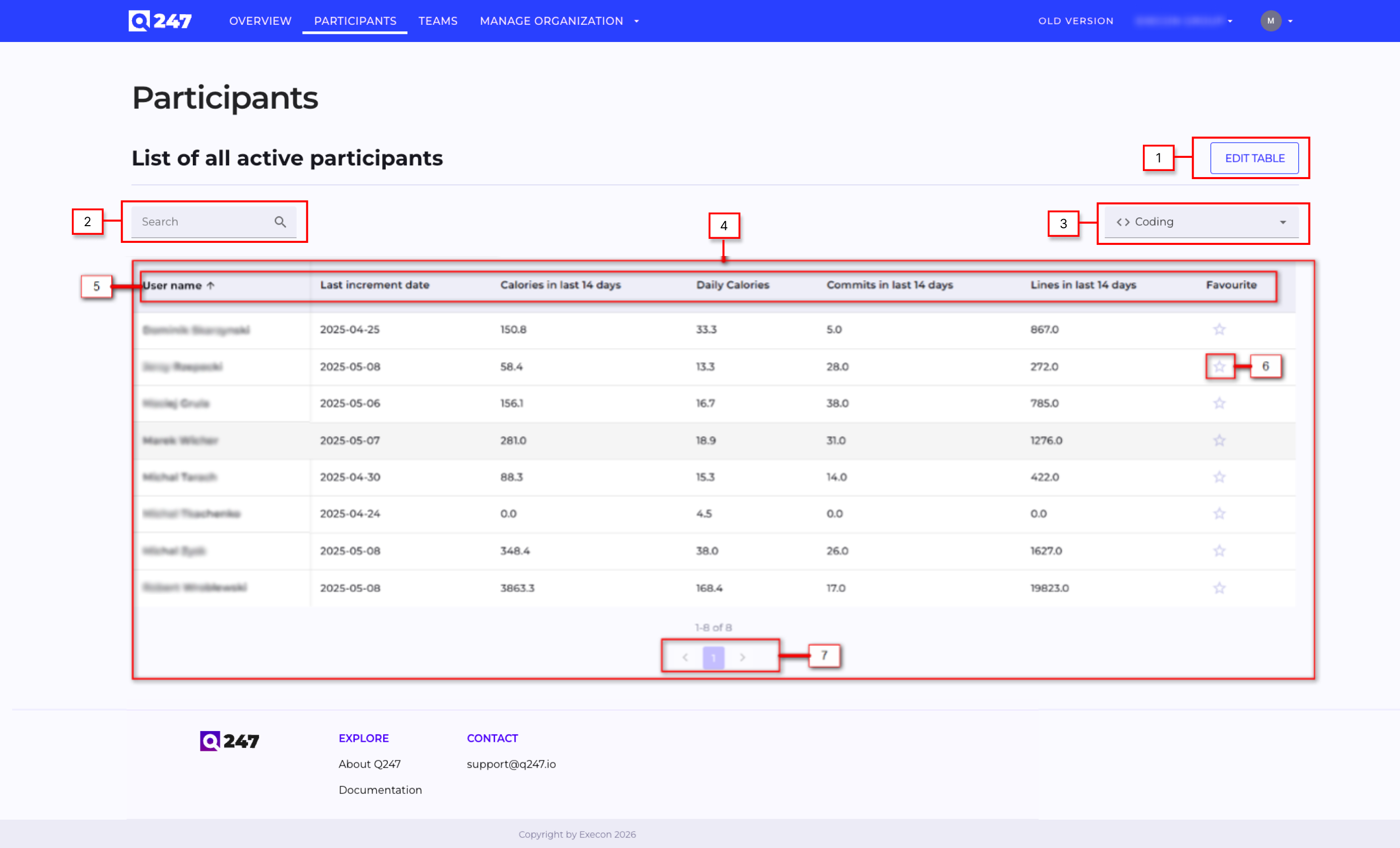
- Edit Table button which opens a pop-up window where user can configure which columns in the table are visible (if the number of columns exceeds width of the table then there is a horizontal scroll in the bottom of the table)
- Search engine which allows user to find a particular active participants within the current organization context
- Filters the table to display Total, Coding, or Documentation data.
- Table of all active participants within the current organization context
- Table header where each column header allows to sort content of the table by that columns content
- Favourite icon which allows user to mark given participant as favourite. Marking a project as favourite results in presenting that project in dedicated section on the Overview page
- Pagination selector which allows user to switch pages in the participants table
Participant details
Q247 user can choose a particular participants and to a dedicated page where metrics for that participant are presented. User can access this page by going through Project page or by Participants page. Participant page contains the following information and functionalities.
Participant baner
At the top of the page, the participant’s full name and email address are displayed. A star icon allows the user to pin this participant to the dashboard on the Overview page for quick access.
Users can:
- Switch between different projects
- Select a date range to view project data
- Filter data by Coding, Documentation, or Total
Data Visualization
Below the filters, a chart visualizes calorie data. Users can switch between different chart types ( calories, incremental and lines).
The chart supports:
- Raw Data view
- Trend view (aggregated/average trend)
A toggle allows switching between these views.
An additional filter allows users to display:
- All calories
- Only visible calories
Participant Metrics
The Participant Metrics section presents a table with key performance indicators, including:
- First increment date
- Duration (working days)
- Calories
- Calories increment date
- Calories per day
- Increments
- Duration
- Increments per day
- Calories per increment
Workload Visualization
This section provides an additional data visualization of the participant’s workload over time.
Users can:
- View workload for the last year, last week, or last day
- Filter data by Coding, Documentation, or Total
The chart uses color intensity to represent workload:
- White and grey indicate inactive or low activity
- Pink, red, and dark red indicate increasing activity levels
- Dark red represents the highest workload and calorie consumption
All Projects
The All Projects section displays a table with data from other projects.
Users can:
- Edit the table layout and choose which columns are visible
- Search within the table
- Select a date range
- Filter by Coding, Documentation, or Total
This table provides an overview of activity and metrics across all available projects.