Workload
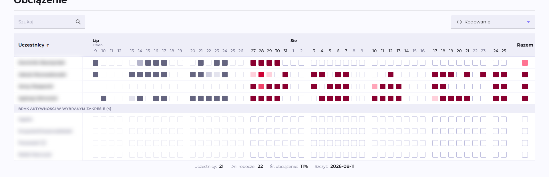
Workload is a heatmap showing how Calories in a project or team are distributed among participants over time. It appears on the Project and Team views.
The same way of looking at a single person is provided by the Activity map on the Participant view, described below.
Color thresholds
Each cell is one participant in one period (day, week, month, or quarter, see below). The shade is determined by what part of the cell's capacity is filled by that participant's Calories.
A cell's capacity is 50 Calories for each business day it covers. Weekends and days off from the organization's work calendar do not count toward this pool, so a weekly column with one holiday has the capacity of four business days. A daily cell has a capacity of 50 Calories even on a weekend.
The scale has six shades of red, at 20% of fill per shade:
| Capacity filled | Shade |
|---|---|
| below 20% | lightest pink |
| 20% to 40% | 2nd shade |
| 40% to 60% | 3rd shade |
| 60% to 80% | 4th shade |
| 80% to 100% | 5th shade |
| 100% and above | darkest red |
Gray and empty cells
The heatmap adds columns from before the selected date range on the left, to fill the width of the browser window. Activity in these columns gets shades of gray instead of red: the same six levels, without color. A gray shade therefore marks history from before the selected period, shown for comparison. These columns are excluded from the total column and from the statistics below the heatmap.
A cell with no Calories is white, outlined with a thin gray line, and has no tooltip on hover. This applies both to the selected range and to the historical columns, where the outline is lighter.
Weekends and days off have cells colored the same way as business days. Only the header of the weekend column is grayed out.
Column granularity
The columns are consecutive days, weeks, months, or quarters. Q247 picks the granularity automatically based on the length of the selected date range and the width of the browser window, so that the columns fit on the screen. This affects only the way of grouping, not the underlying data.
Aggregate row
Activity that could not be attributed to a specific, mapped person goes into the aggregate "Others" row. This row sums the Calories of multiple people, so its capacity is multiplied by the number of people with activity in that period. The shade in this row therefore corresponds to the average per person, the same way as in the other rows.
Statistics at the bottom
The number of participants, the number of business days in the selected range, the average workload (what percentage of the target was used on average), and the day or period with the peak activity.
Activity map on the Participant view
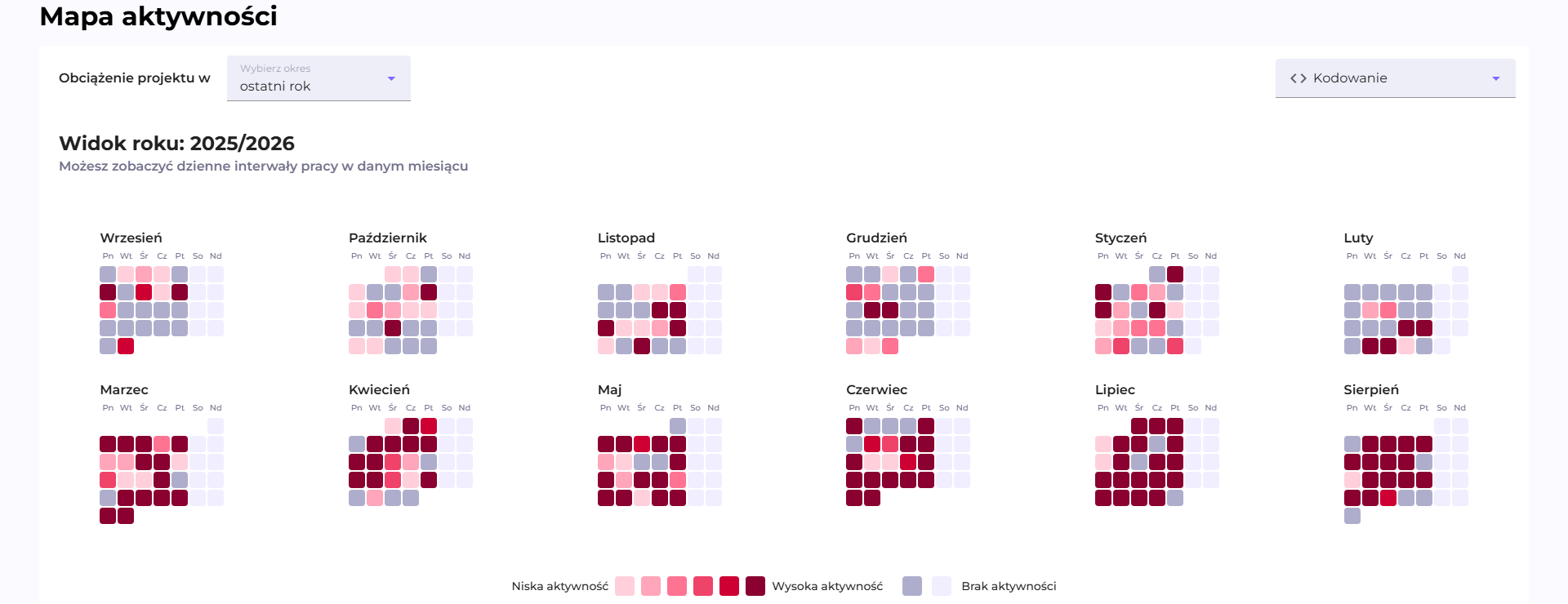
The Activity map shows the same phenomenon for one person: the distribution of their Calories over time. One row from the Workload heatmap turns here into a calendar grid, which makes it possible to see the whole year at once.
The "Select timeline" dropdown switches the resolution, and the selected range is independent of the date selector in the top bar of the page:
| Range | One cell | Full cell capacity |
|---|---|---|
| Year | one day | 50 Calories |
| Week | six hours | 12.5 Calories |
| Day | fifteen minutes | about 0.5 Calories |
The color thresholds are the same as in Workload: six shades of red at 20% of fill each, calculated against the full cell capacity from the table above. The legend below the heatmap labels this scale from "Low activity" to "High activity".
Gray squares have a different meaning here than in Workload and mark no activity, in two variants labeled in the legend as "No activity":
- Full gray: a business day with no activity.
- Very light, almost white: a Saturday or Sunday with no activity.
The yearly calendar fills each month to its end, so days of the current month that have not yet arrived are also gray. The transparent squares at the start and end of a month are the grid's alignment to the days of the week. A tooltip with the number of Calories, Lines, and Increments appears only on cells with activity.
The whole grid concerns one person and the range selected in the dropdown, so what appears here is just the heatmap with a legend, without the aggregate row, the statistics below, and the historical columns that Workload has.
Workload shows directly what a plain table with totals does not: when and who worked, not just how much in total. A row with many dark cells spread evenly over time is a person working consistently; a row with a single very dark cell and the rest empty is work concentrated in one burst. The same total Calories for the period can produce a completely different picture on the heatmap. A column (day/week) with a dark bar for many people at once usually corresponds to a real event in the project (a deadline, the end of a sprint), not to chance. An empty column across the whole team at once is usually a day off not captured in the organization's work calendar, worth checking if it recurs regularly.